The fine folk at Flowing Data have been staying on top of all this for us and I thought I'd share some of their findings.
It turns out that local affiliates were having a tough time keeping it all straight. Way back in 2009 there was a pretty interesting example of math as done the Murdoch way when Fox Chicago provided us with this pie chart.
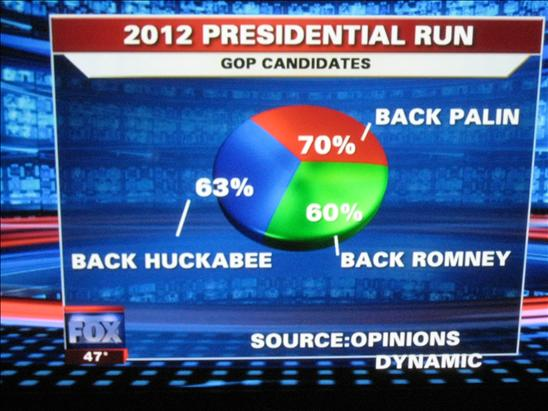
Yup, 63 plus 60 plus 70 adds up to 100. Right?
It's tough keeping all those foreign names straight you know, like Murdoch, Lonergan, O'Neil, Obama, Usama... so a while back, Fox 40, a local Fox News Network affiliate provided us with this charming image:

Since the guys in the back spend all day saying bad things about this "Obama" person, I suppose their fingers just automatically typed "Obama" when it should have been "Usama". You know how it is when you spend all day spinning the news, it gets repetitive, almost mindless.
After a feat like that, screwing up other things when referring to a sitting President are easily done. For example, we all know that this Obama bin Laden guy can't get anything right, especially since he's dead. And the chart below proves it!
In December 2011 the jobs data indicated a drop. Now it wasn't a big drop, and these statistics are always subject to differences in opinion. Rupert's troops took matters into their own hands and published this image on their channel:
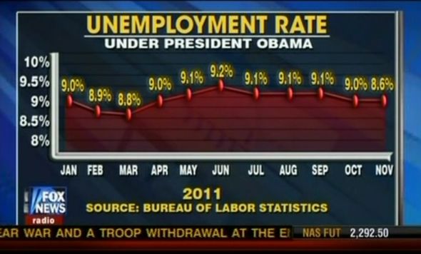
Having problems spotting the discrepancy? That's OK, it seems as if the Fox anchors and the on air crew didn't see it either or they surely would have corrected it immediately. Right? I mean the November 8.6% number being higher than the 8.8% number in March is all that Obama guy's fault.
Here's how the chart should have looked:
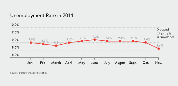
Odd that the shapes don't match. Well, vaguely.
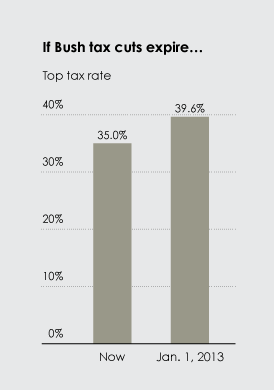
And then there's the really old school tricks. I remember Ross Perot pulling chart magic like this during his presidential bid. The man was sitting there doing Power Point presentations that absolutely lied in nearly every respect. He used this technique and I suppose the Fox folk figured it would work again.
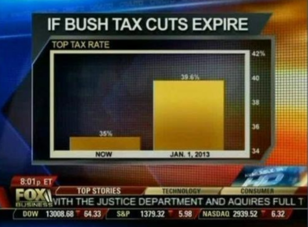
Nothing wrong with that chart, right? Well, right, so long as you want to make a difference look seven times larger than it is. I guess they gave the 35% a full one percent on the chart instead of just leaving it off completely. The idea of bar or column charts is to look at the whole figure for comparison, not just the change.
Flowing Data kindly provided the correct column chart so that you can easily see what the difference implies. Have a look.
OH MY GOD! WE'RE ALL GONNA GO BROKE AND STARVE TO DEATH!
Right?


No comments:
Post a Comment
Have a look at the comment policy. You can find it at . http://tweetingdonal.blogspot.com/p/comment-policy.html